Large Feature Image Fiasco
In each blog post, I set a featured image that I believe relates to the topic being covered in the post. I realized that many images were large and you actually had to scroll quite a ways down to see the text of the blog post. This was a comment I received from a few of my peers as they were reviewing my website. I took their comments and decided this week to experiment with the additional CSS option in my theme.
I spent an hour researching how to change the image size and tried to set the size by selecting it in the post and inputting the width and height I wanted but, no luck. I remembered I could add the develop tab to my menu and select the “Show Web Inspector” from the drop-down. From there I found the HTML to change all of my post media images. Then I had to figure out how to change that to CSS.
I ended up finding the code I needed but had no idea because I copied the whole thing from the website when I only needed a portion of it. Therefore, I thought it was wrong and continued searching. I finally admitted defeat and asked my husband for help. He assured me the code I found was correct and I just needed to change a few things. We were able to add the code to the Additional CSS box and we added an additional measure to center the feature image at the top.
Here is the code we used to make all my feature images the same width and centered:
.post-media, .post-body img, .post-body .tr-caption-container {
padding: 5px;
max-width: 400px;
margin: auto;
}
Credit to my husband, Alex Hazel and the website albemarlePR
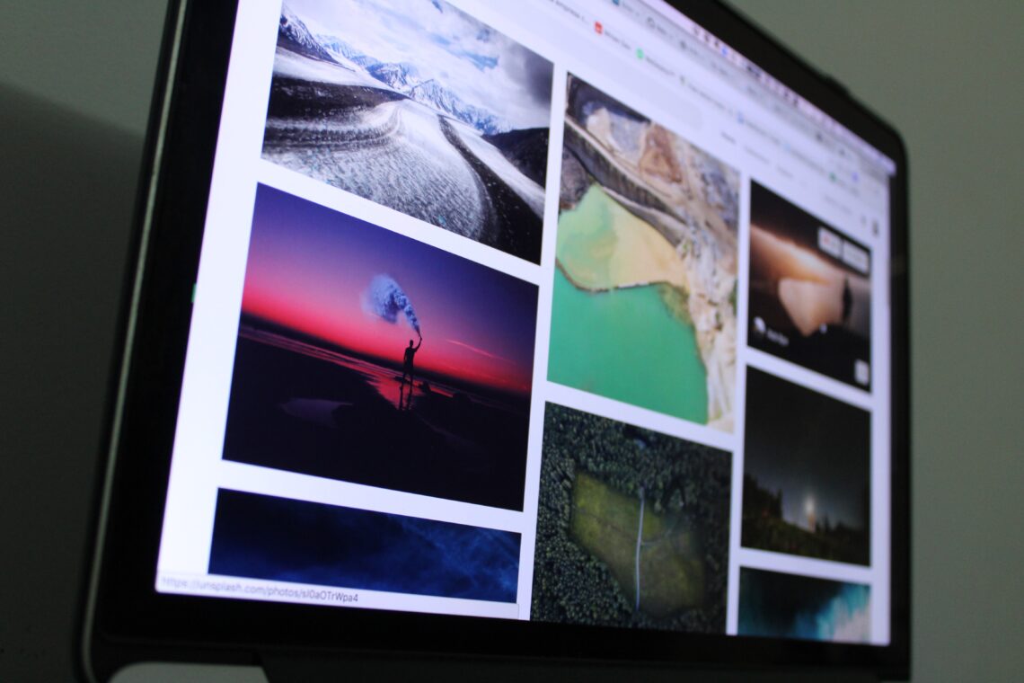
Photo credit: Photo by Guilherme Vasconcelos on Unsplash

Let's Embed. That. Video!


2 Comments
Eva Conover
Thank you Lisa (and Alex)!! You are lifesavers.
Andrea Squires
Hi Lisa, I have just run into the same problem and you have saved me so much work. Thank you!!!!